The Pink Pavilion
Pink triggers a synaesthetic reaction that makes my teeth hurt: one of my earliest childhood memories is of being given sickly-sweet, gigantic, violently pink lollipops on long car journeys, presumably to keep me quiet.
Until the recent rehabilitation of Barbie through the Greta Gerwig movie, I despised every aspect of the Barbie franchise and have not forgiven Mattel for dressing a 1980s astronaut Barbie in pink. And yet, I feel myself drawn to pink, and often catch myself being moved by it, in all its intensities. I also must admit that in fashion it can be an extremely flattering, punchy, and fun colour (yes, I did dress up in pink for the Barbie movie).
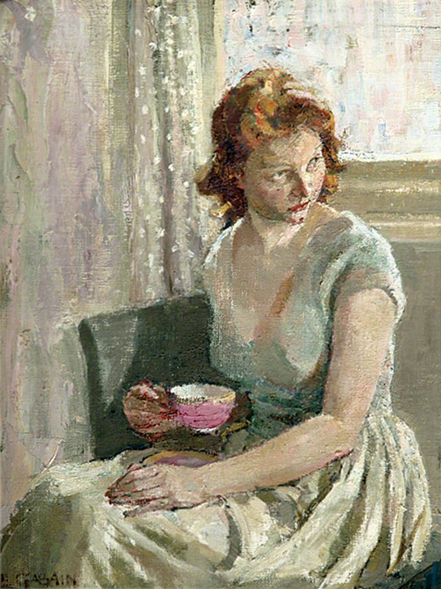
Pinks, whether they are soft and light or strong and saturated, often cut through the visual noise. When I went to the London Art Fair this year, I enjoyed much of the work on display, but nothing made me laugh out loud apart from David Shrigley’s screen print of a hot-pink ghost, and in Brighton & Hove Museums’ fine art collection, it is that pink cup held by the slightly surly looking women in a small painting by Ethel Gabain that pulls a chromatic punch in an otherwise rather chaste, pale composition.
A few days earlier, I had the opportunity to see the exhibition Monet and London: Views of the Thames at the Courtauld, which was largely a misty-eyed love letter in paint to London of the early 20th century. Yes, there were more than fifty shades of grey, blue and violet depicting the fog and smog of London like blooming flowers, but what really surprised me were the tufty rose-coloured patches that Monet inserted into the painted soot of the city.
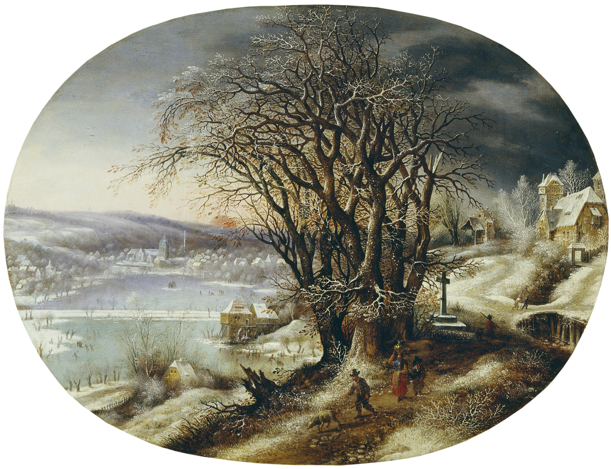
If you would like to see similar pink depictions of atmosphere in our collections, you will find them in Adrian Hill’s shimmering painting of a rain-soaked Brighton seafront from the 1930s, or Denijs van Alsloot’s Winter Landscape with Distant Village (c1590-1614), both currently on display in Brighton Museum.
A paler shade of red
It is perhaps the oscillation between barely-there light rosy tints and intense shocking pinks that make this such an alluring and infuriating colour. By rights, it is not even an individual colour. Technically, pink is a tint: just red with white added to it (a whiter shade of red, you might say). Pink doesn’t often feature as a named colour in early colour literature, and there are few pigments that we could class as pink – most are just red pigments watered down or made lighter through the addition of white.
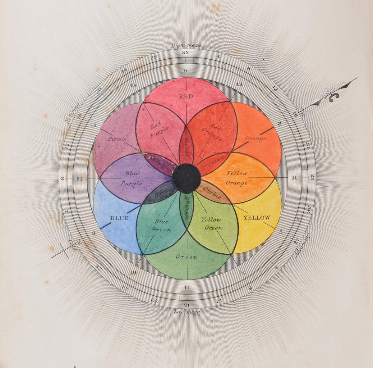

My most trusted colourman of the 19th century, George Field (whose books from 1817 and 1841 are currently on display in the King’s Library in the Royal Pavilion as part of the COLOUR exhibition) does not name pink on his colour diagrams, but he shows it, tantalisingly, at the top of his flower-like colour circle from 1841 (labelling it red, but to me it is closer to pink), and even more intriguingly, he places it at the very centre of his 1817 diagram illustrating the analogy of colour and music.
But as we will see below, my countryman Goethe had even bigger ideas about pink. From the later 19th century onward, pinks take pride of place in literature about colour: Robert Ridgway’s magnificent book Color Standards and Color Nomenclature, from 1912, with over a thousand hand-painted colour swatches, positively revels in pinks and gives them delicious names, including Safrano Pink, Orient Pink, Amaranth Pink, Cinnamon Pink, Shrimp Pink, Strawberry Pink, Laelia Pink, and Coral Pink. This is almost pink poetry.
The naming of both the colour and light-red pigments is slippery, sometimes misleading, and varies between languages.
In several European languages rose is the overarching name for what in English we would call paler, pastel pinks, with a direct reference to the rose flower (in German, as in Italian and Spanish, ‘rosa’), while pink is reserved for the more saturated versions, closer to fuchsia (another flower name, of course).
As for pigments that create pinks, a common one was cochineal or carmine lake, an organic pigment made from parasitic insects on cacti sourced largely in South America.
A European alternative was kermes, but it would not yield the same strong tones of pink and scarlet. Throughout the Middle Ages, light tints of reds (mostly as dyestuffs) and chalky pinks were also created from brazilwood, which was much more common than kermes or cochineal. Madder lake, derived from the root of madder plants (Rubia tinctorum) was an important dye from at least the Middle Ages, and together with its isolated colourant alizarin it offered perhaps the widest range of what we consider pinks. By 1869, it had been synthesized by a pair of German chemists, effectively killing off the commercial cultivation of madder plants.
Floral pinks
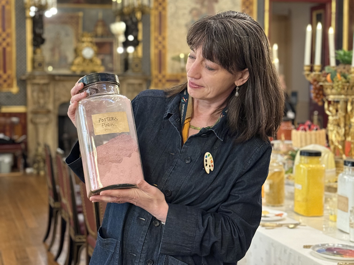
The naming of pink also comes from a plant: ‘pink’ is an old word for the Dianthus carnation, which, together with (pink) roses gave their name and visual association to the pink range of colours. There was even a now largely forgotten synthetic pink pigment used by potters in the 18th and early 19th century named after carnations: Potter’s Pink or Tin Pink was originally called Nelkenfarbe in German (literally, ‘carnation colour’).
A better-known historic pink is the splendidly named Rose Pompadour, a vibrant ground colour for ceramics, invented by the famous manufactory Sèvres in 1757. It was given its name in honour of Madame de Pompadour, who was a collector of ostentatious, colourful Sèvres porcelain (very much loved by the Prince Regent!). Both Madame Pompadour and this Sèvres pink became synonymous with the beauty, magnificence, and decadence of 18th-century France.
A gendered colour?
Pink has not always been associated with women, femininity, and young girls: the pinkification of girlhood has its origin sometime in the early 20th century in America. Before then, clothes and toys for babies and young children were neutral or interchangeable.
Indeed, in Catholic countries and regions, powder blue remained a colour associated with girls for longer, as it was a lighter version of the blue of the Madonna, while pink, as the lighter version of red, a colour representing masculine power, was often assigned to boys.
But the story is more complex, and the gendering of pink has been reverted, challenged, and played with many times in history. My colleague Dominique Grisard has published some fascinating research into the cultural shifts concerning pink, some of which you can find in the splendid book PINK, edited by Valerie Steele. A new book on the history of pink in the by the great colour historian Michel Pastoureau has also just been published.
One of the reasons why pink can be symbolic of both innocent girlhood, eroticised femininity, and even sexual deviance is its closeness to (white) flesh colour and blood, with associations of sexual organs, orifices, and arousal. By applying rosy-pink makeup, as seen in a sugar-sweet portrait of Madame Pompadour by François Boucher, women (and some men) deliberately or inadvertently tapped into this notion, and effectively eroticised themselves. This perceived sexiness of pink has been utilised in film, photography, advertising and fashion, but paler versions of pink still retain some associations of domesticity and compliance.
These associations are fluid and lend themselves to reinterpretation. Just look at Judy Chicago feminising whole landscapes with pink and purple smoke bomb pyrotechnics or remind yourselves of the pink pussyhats worn by the demonstrators on the 2017 Women’s Marches in the US, or indeed the colouring of the 2023 Barbie movie, which is surprisingly pale. It goes without saying that pink is now a completely gender-fluid colour and one of the symbols of LGBTQ+ culture. The latter has sinister origins: a downward-pointing pink triangle was the badge Nazis gave concentration camp prisoners they had identified as gay. Later, this symbol was both literally and metaphorically turned on its head, becoming a badge of pride and solidarity.
The pink Pavilion
The current exhibition COLOUR: A Chromatic Promenade Through the Royal Pavilion tells the story of pink in the Pavilion. Indeed, the displays begin in the Long Gallery, which is an architectural space that plays with your senses through an almost ‘drenched’ colour scheme that includes pink walls, niches in pink imitation marble, a carpet with a pink base colour, and much indirect lighting and reflection. The effect has been designed to resemble a courtyard at sunset.
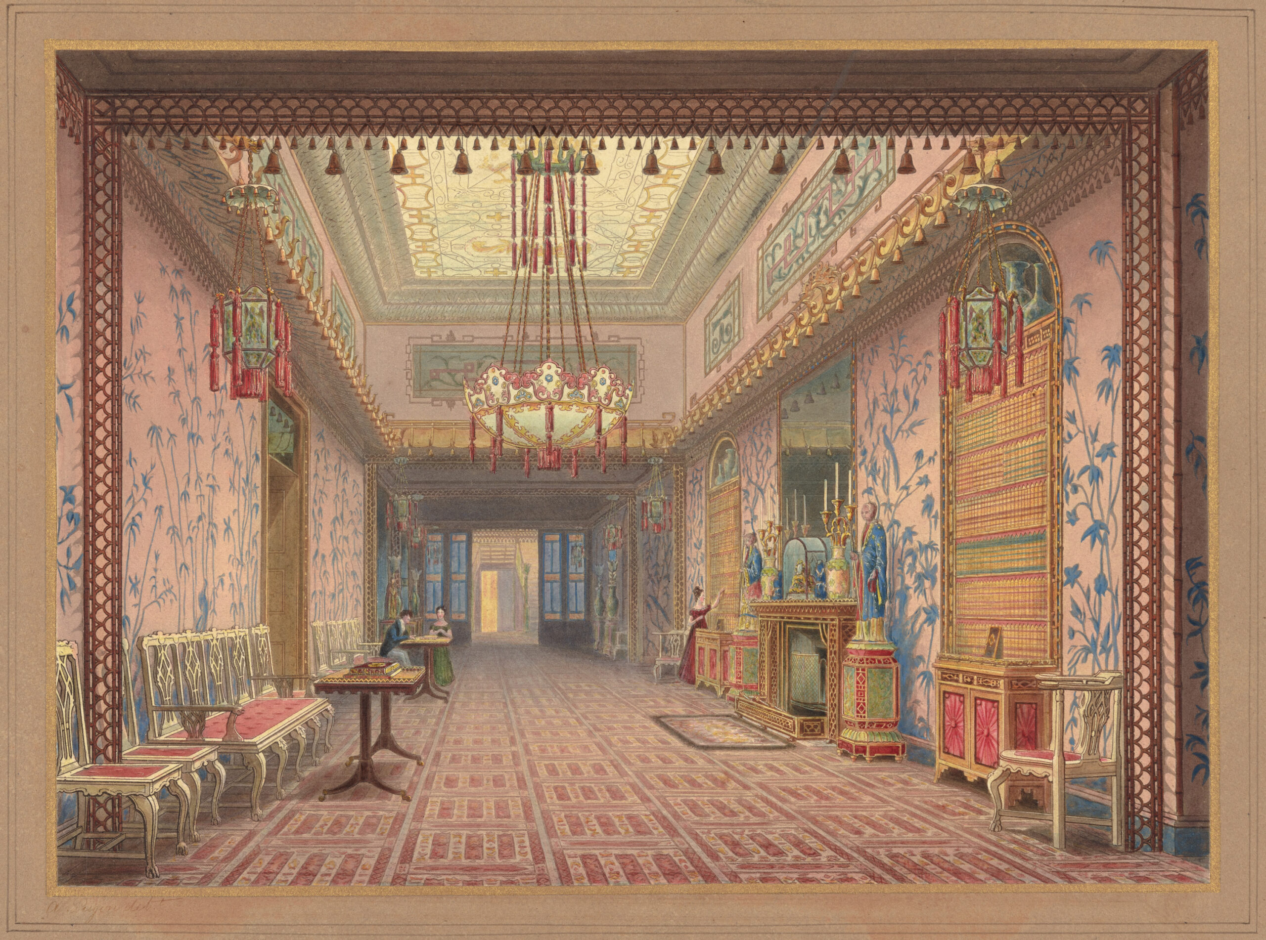
In 1823 local historian Richard Sickelmore described the Long Gallery as
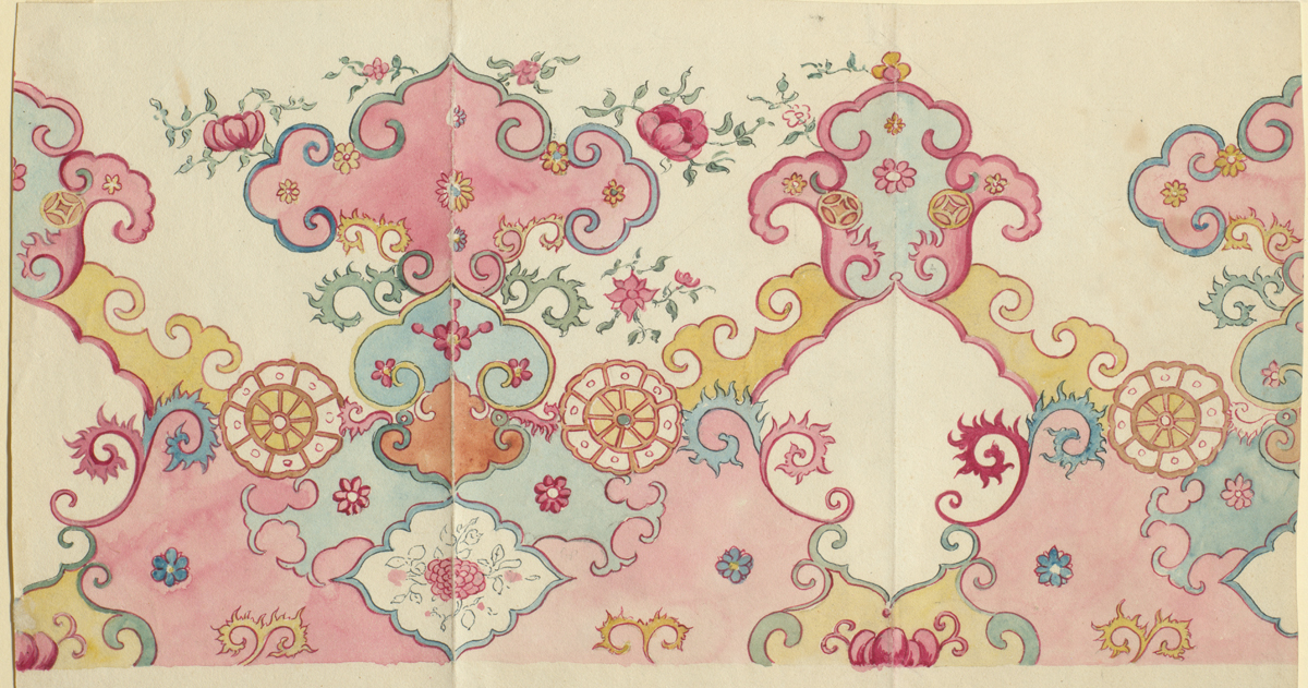
referring to the ceiling and walls as ‘coloured peach-blossom throughout, with niches, figures, &c. and light blue emblazonments in the Chinese fancy’, thus describing the hand-painted wallpaper by Frederick Crace, of which one original fragment survives.
The design was possibly influenced by famille rose (pink-coloured) Chinese ceramics, examples of which are on display in the exhibition. The term peach-blossom is fascinating, as it was also used by Crace himself, to describe a very pale pink in the first room of the Royal Pavilion, the Octagon Hall. Peach blossom is not a pigment name but is a colour name that appears to have been popular in Britain in the 1820s, as there is a cluster of citations in popular and more specialised literature. Its descriptive name from the botanical realm indicates that it described a range of pink tones.
This suggests a possible intellectual link with Goethe’s work on colour, including Beyträge zur Optik (1791–2) and his substantial Farbenlehre (1810), in which he discussed peach-blossom colour (Pfirschblüt or Pfirsichblüthroth) as a prismatic colour that is found on the edge of light and darkness, at the centre of the so-called ‘inverted spectrum’.
He considered it the purest of colours. Like George Field several years later, he placed it at the very top of one of his colour circles, between orange and violet. It is, in the end, just an evocative name for a range of pinks, but it also means that there was a healthy intellectual exchange between Germany and Britain in the early 19th century, and I like the thought of Goethe’s pink peach blossom petals drifting across the channel, all the way on to the walls of George’s transgressive Brighton Pavilion.
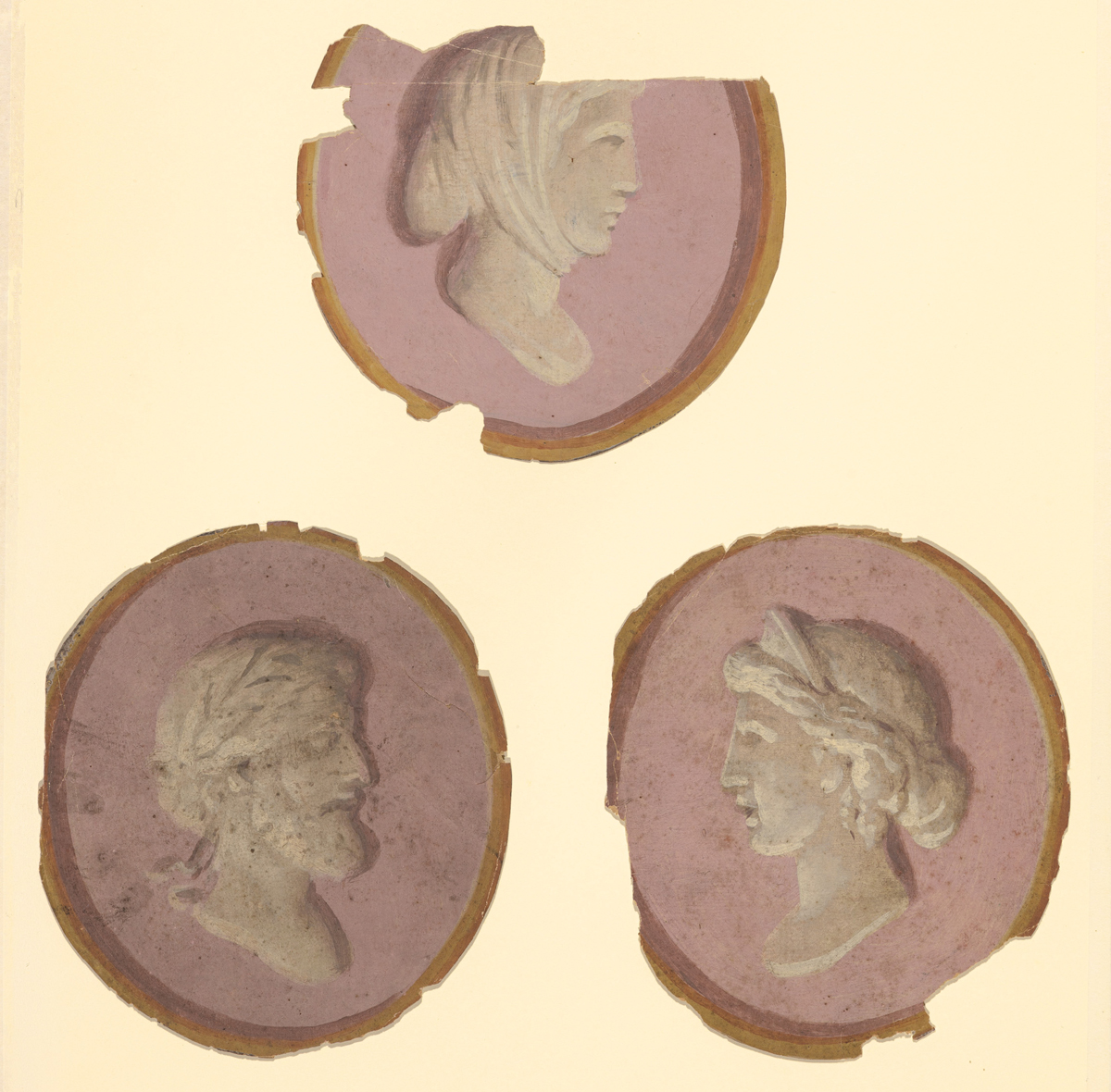
Pink was also present before the Royal Pavilion’s interiors got their Chinoiserie makeover in early 1800s. The neo-classical, late-eighteenth-century look of the Pavilion is almost forgotten, and not much of its decorations survive, but we know that in the 1780s and ‘90s the state rooms would have been decorated in pastel shades of blue, yellow, green and pink on a white or cream ground.
There are no reliable images of those interiors, but among the fragments of wall decorations in the Royal Pavilion Archives are some pastel-coloured fragments that probably formed part of the neo-classical scheme for the Saloon, designed by Biagio Rebecca in the 1780s.
They are three painted roundels with heads in profile, imitating white marble and in the style of cameos, against a dusty pink background and a single mask-like face with an open mouth, wearing a laurel wreath. As they have such a ghostly-pink presence, I was keen to include them in my new book of the Royal Pavilion: The Royal Pavilion, Brighton: A Regency Palace of Colour and Sensation (Yale University Press). They have never before been published in a book.
Death by rose petals
One of the pinkest paintings in art history is Lawrence Alma-Tadema’s The Roses of Heliogabalus (1888). The enormous canvas shows a group of overindulging Romans being suffocated by thousands of pink rose petals, while the young Emperor Heliogabalus, clad in gold robes, watches their demise haughtily from an elevated position, along with his entourage.
There is a surprising link between this story and the Royal Pavilion: on a visit in January 1822, the sharp-tongued Russian Princess Dorothea von Lieven commented on the decadent and intoxicating atmosphere at the Pavilion during an extended dinner
She reports that the Duke of Wellington’s reaction to this decadence was ‘Devil take me, I think I must have got into bad company’.

A shorter and slightly different version of this article was published in issue 12 of ROSA Magazine in Spring 2025.
